Слияние кода завершено, страница обновится автоматически
 <ws:NotifyIcon Title="WPF разработчик" Name="WpfNotifyIcon">
                <ws:NotifyIcon.ContextMenu>
                    <ContextMenu>
                        <MenuItem Header="Сообщения в трее" Click="SendMessage_Click"/>
                        <MenuItem Header="Мигание" Name="menuItemTwink"  Click="Twink_Click"/>
                        <MenuItem Header="О программе" Click="About_Click">
                            <MenuItem.Icon>
                                <Path Data="{StaticResource PathWarning}"
                                      Fill="{DynamicResource PrimaryNormalSolidColorBrush}"
                                      Stretch="Uniform" Height="20" Width="20"/>
                            </MenuItem.Icon>
                        </MenuItem>
                </ws:NotifyIcon.ContextMenu>
            </ws:NotifyIcon>
``` ### Button

1) XAML
``` XML
 <WrapPanel Margin="0,10">
                    <Button Content="Default"/>
                    <Button Content="Default" Margin="10,0" IsEnabled="False"/>
                    <Button Content="Primary" Style="{StaticResource PrimaryButton}"/>
                    <Button Content="Primary" Style="{StaticResource PrimaryButton}" Margin="10,0" IsEnabled="False"/>
 </WrapPanel>
 <WrapPanel Margin="0,10">
                   <RadioButton Content="Option A"/>
                    <RadioButton Content="Option B" Margin="10,0" IsChecked="True"/>
                    <RadioButton Content="Option C" IsEnabled="False"/>
 </WrapPanel>
 <WrapPanel Margin="0,10">
                 <CheckBox Content="Option A"/>
                 <CheckBox Content="Option B" Margin="10,0" IsChecked="True"/>
                 <CheckBox Content="Option C" IsChecked="{x:Null}"/>
                 <CheckBox Content="Option D" Margin="10,0" IsEnabled="False"/>
 </WrapPanel>
 <WrapPanel Margin="0,10">
                  <TextBox/>
                    <TextBox Margin="10,0" ws:ElementHelper.Watermark="请输入内容"/>
                    <TextBox IsEnabled="False"/>
 </WrapPanel>
 <WrapPanel Margin="0,10">
                <PasswordBox />
                    <PasswordBox Margin="10,0" ws:ElementHelper.Watermark="请输入密码"/>
                    <PasswordBox IsEnabled="False"/>
                     <!--水印和密码重叠-->
                     <PasswordBox Margin="10,0" ws:ElementHelper.Watermark="请输入密码"
                     ws:PasswordBoxHelper.IsMonitoring="True"/>
                    <!--MVVM Binding-->
                     <PasswordBox ws:PasswordBoxHelper.IsMonitoring="True"
                         ws:ElementHelper.Watermark="请输入密码"
                         helpers:PasswordBoxHelper.Attach="True"
                         helpers:PasswordBoxHelper.Password="{Binding Path=Account.PassWord,Mode=TwoWay,UpdateSourceTrigger=PropertyChanged}" Margin="0,10"/>
 </WrapPanel>
 <WrapPanel Margin="0,10">
              <ComboBox Width="200">
                        <ComboBoxItem>Option 1</ComboBoxItem>
                        <ComboBoxItem>Option 2</ComboBoxItem>
                        <ComboBoxItem>Option 3</ComboBoxItem>
                        <ComboBoxItem>Option 4</ComboBoxItem>
                        <ComboBoxItem>Option 5</ComboBoxItem>
                    </ComboBox>
 </WrapPanel>
 <WrapPanel Margin="0,10">
           <ToggleButton/>
                    <ToggleButton Margin="10,0" IsEnabled="False"/>
                    <ToggleButton IsChecked="True"/>
 </WrapPanel>
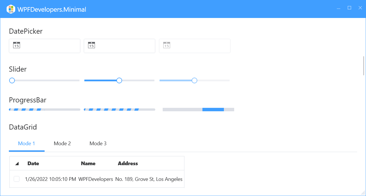
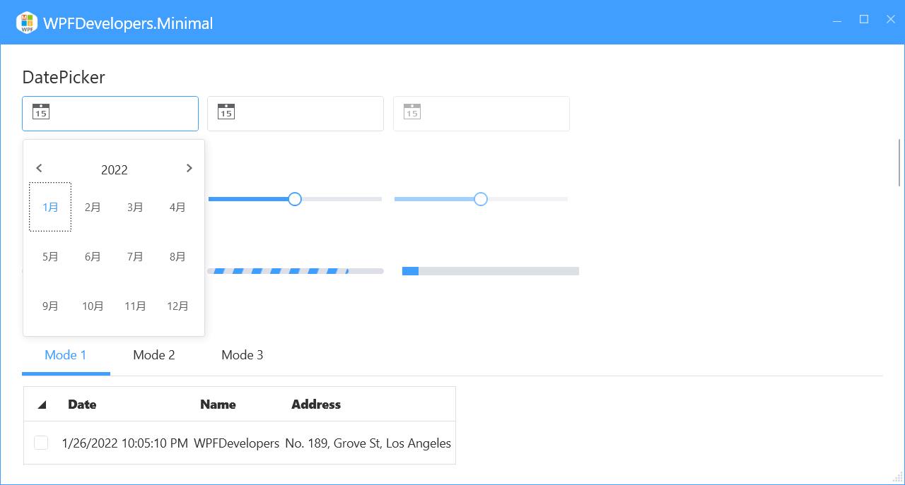
<WrapPanel Margin="0,10">
<DatePicker Width="200"/>
<DatePicker Width="200" SelectedDateFormat="Long" **Маржа = «10, 0» />**
**<DatePicker Width = «200» IsEnabled = «False» />**
* * *
**WrapPanel**
**Margin = «0,10»**
**<Slider Width = «200»>**
**<Slider Width = «200» Value = «50» Maximum = «100» Margin = «10,0» >**
**<Slider Width = «200» Value = «50» Maximum = «100» IsEnabled = «False» >**
**</WrapPanel>**
* * *
**ProgressBar**
**1) XAML**
**Margin = «0,10»**
**<ProgressBar Width = «200» Value = «50» >**
**<ProgressBar Width = «200» Margin = «10,0» Value = «80» ws:ElementHelper.IsStripe = «True» >**
**<ProgressBar Width = «200» Margin = «10,0» IsIndeterminate = «True» Value = «10» >**
**</WrapPanel>**
* * *
**DataGrid**
**1) XAML Mode 1**
**Margin = «0,10»**
**AutoGenerateColumns = «False»**
**HeadersVisibility = «All»**
**RowHeaderWidth = «40»**
**ItemsSource = "{Binding UserCollection, RelativeSource = {RelativeSource AncestorType = local: MainView}}" >**
**<DataGrid.RowHeaderTemplate>**
**<DataTemplate>**
**<CheckBox IsChecked = "{Binding IsSelected, RelativeSource = {RelativeSource AncestorType = DataGridRow}}"/>**
**</DataTemplate>**
**</DataGrid.RowHeaderTemplate>**
**<DataGridTextColumn Header = "Date" Binding = "{Binding Date}" IsReadOnly = "True" >**
**<DataGridTextColumn Header = "Name" Binding = "{Binding Name}" IsReadOnly = "True" >**
**<DataGridTextColumn Header = "Address" Binding = "{Binding Address}" IsReadOnly = "True" >**
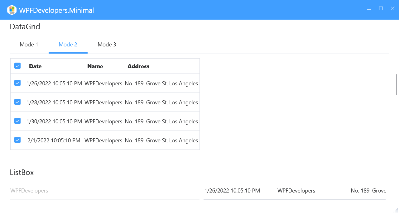
**2) XAML Mode 2**
**Margin = «0,10»**
**AutoGenerateColumns = «False»**
**ItemsSource = "{Binding UserCollection, RelativeSource = {RelativeSource AncestorType = local: MainView}}" >**
**<DataGridTemplateColumn CanUserResize = «False»>**
**<DataGridTemplateColumn.HeaderTemplate>**
**<DataTemplate>**
**<CheckBox IsChecked = "{Binding RelativeSource = {RelativeSource Mode = FindAncestor, AncestorType = local:MainView}, Path = AllSelected}" />**
**</DataTemplate>**
**</DataGridTemplateColumn.HeaderTemplate>**
**<DataGridTemplateColumn.CellTemplate>**
**<DataTemplate>**
**<CheckBox Margin = "10,0,0,0" IsChecked = "{Binding IsChecked}"/>**
**</DataTemplate>**
**</DataGridTemplateColumn.CellTemplate>**
**<DataGridTextColumn Header = "Date" Binding = "{Binding Date}" IsReadOnly = "True" >**
**<DataGridTextColumn Header = "Name" Binding = "{Binding Name}" IsReadOnly = "True" >**
**<DataGridTextColumn Header = "Address" Binding = "{Binding Address}" IsReadOnly = "True"** **ListBox**
1. XAML
``` XML
<WrapPanel Margin="0,10">
<ListBox DisplayMemberPath="Имя" IsEnabled="False"
ItemsSource="{Binding UserCollection,RelativeSource={RelativeSource AncestorType=local:MainView}}">
</ListBox>
<ListBox Margin="10,0"
ItemsSource="{Binding UserCollection,RelativeSource={RelativeSource AncestorType=local:MainView}}">
<ListBox.ItemTemplate>
<DataTemplate>
<UniformGrid Columns="3">
<TextBlock Text="{Binding Дата}"/>
<TextBlock Text="{Binding Имя}"/>
<TextBlock Text="{Binding Адрес}"/>
</UniformGrid>
</DataTemplate>
</ListBox.ItemTemplate>
</ListBox>
</WrapPanel>
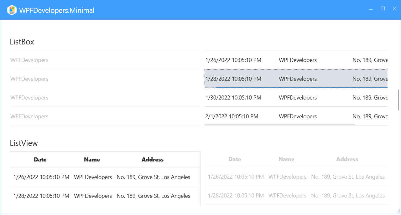
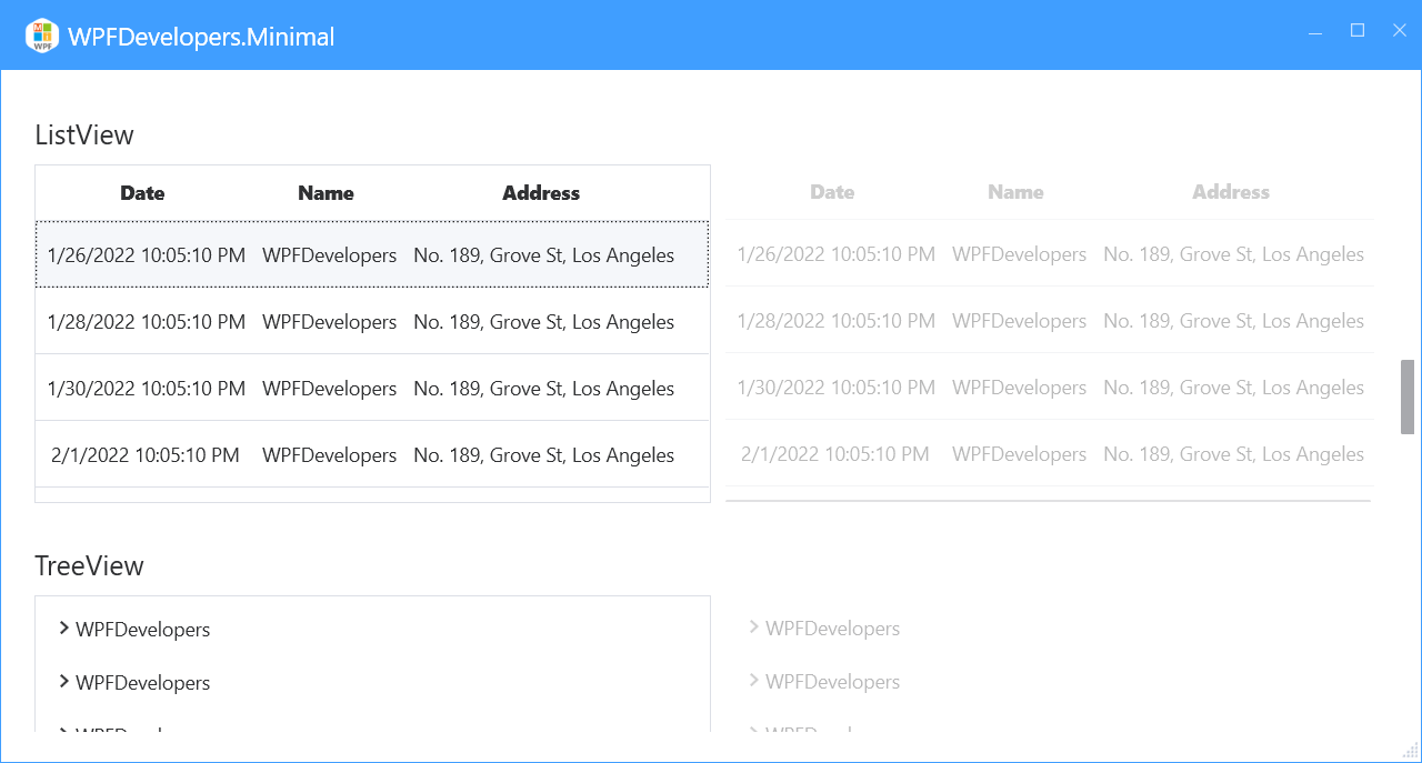
ListView
 <WrapPanel Margin="0,10">
       <ListView ItemsSource="{Binding UserCollection,RelativeSource={RelativeSource AncestorType=local:MainView}}">
                        <ListView.View>
                            <GridView>
                                <GridViewColumn Header="Дата" DisplayMemberBinding="{Binding Дата}" />
                                <GridViewColumn Header="Имя" DisplayMemberBinding="{Binding Имя}" />
                                <GridViewColumn Header="Адрес" DisplayMemberBinding="{Binding Адрес}" Width="Auto"/>
                            </GridView>
                        </ListView.View>
                    </ListView>
                    <ListView IsEnabled="False" Margin="10,0" BorderThickness="0"
                              ItemsSource="{Binding UserCollection,RelativeSource={RelativeSource AncestorType=local:MainView}}">
                        <ListView.View>
                            <GridView>
                                <GridViewColumn Header="Дата" DisplayMemberBinding="{Binding Дата}" />
                                <GridViewColumn Header="Имя" DisplayMemberBinding="{Binding Имя}" />
                                <GridViewColumn Header="Адрес" DisplayMemberBinding="{Binding Адрес}" Width="Auto"/>
                            </GridView>
                        </ListView.View>
                    </ListView>
 </WrapPanel>
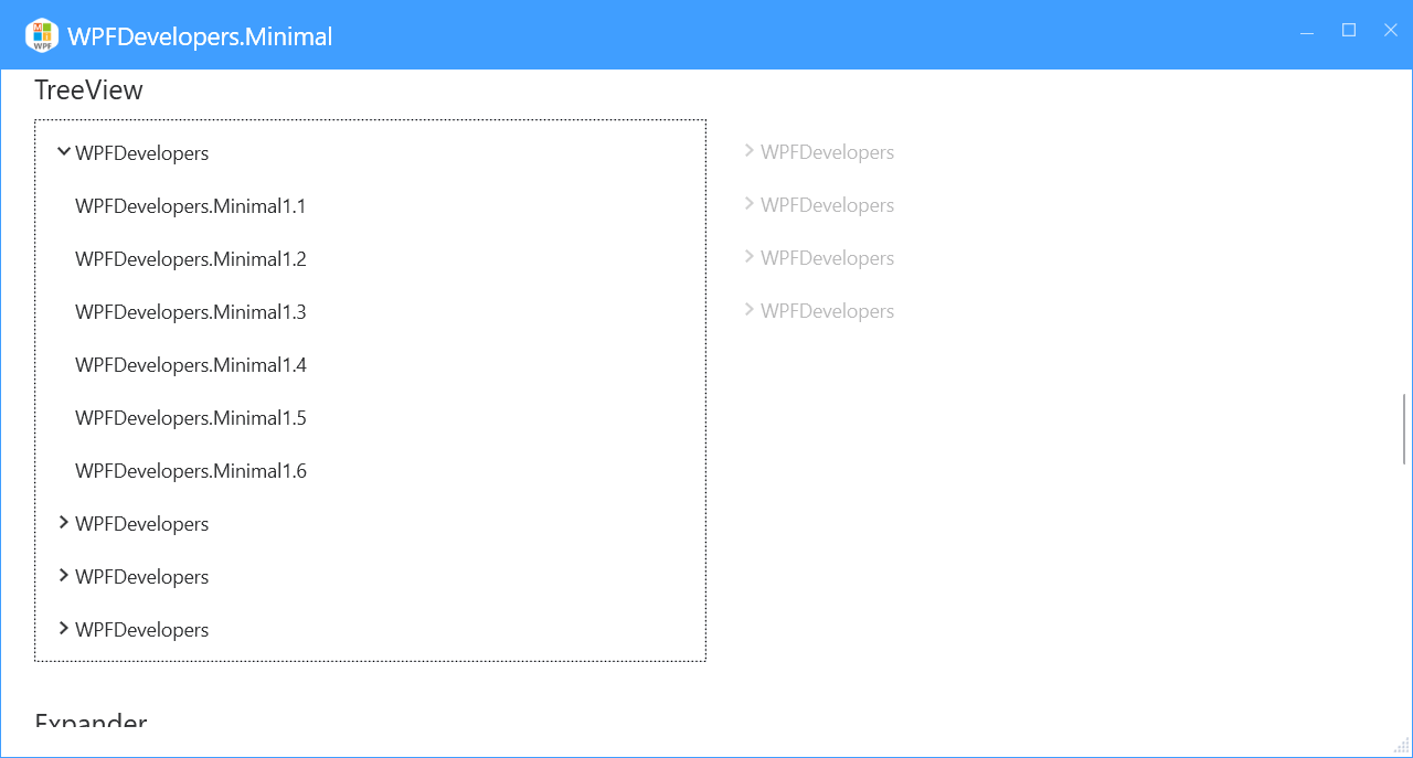
TreeView
 <WrapPanel Margin="0,10">
       <TreeView ItemsSource="{Binding UserCollection,RelativeSource={RelativeSource AncestorType=local:MainView}}">
                        <TreeView.ItemTemplate>
                            <HierarchicalDataTemplate ItemsSource="{Binding Children}">
                                <Border>
                                    <TextBlock Text="{Binding Path=Имя}"/>
                                </Border>
                            </HierarchicalDataTemplate>
                        </TreeView.ItemTemplate>
                    </TreeView>
                    <TreeView IsEnabled="False" Margin="10,0" BorderThickness="0"
                              ItemsSource="{Binding UserCollection,RelativeSource={RelativeSource AncestorType=local:MainView}}">
                        <TreeView.ItemTemplate>
                            <HierarchicalDataTemplate ItemsSource="{Binding Children}">
                                <Border>
                                    <TextBlock Text="{Binding Path=Имя}"/>
                                </Border>
                            </HierarchicalDataTemplate>
                        </TreeView.ItemTemplate>
                    </TreeView>
 </WrapPanel>
``` ### Expander

1. XAML
``` XML
  <UniformGrid Margin="0,10" Columns="2">
                    <Expander Header="Expander1">
                        <Rectangle Fill="{DynamicResource DangerSolidColorBrush}"
                                   Width="400" Height="300"/>
                    </Expander>
                    <Expander Header="Expander1" ExpandDirection="Up" Margin="10,0" FlowDirection="RightToLeft" IsExpanded="True">
                        <Rectangle Fill="{DynamicResource LightSolidColorBrush}"
                                   Width="400" Height="300"/>
                    </Expander>
                    <Expander ExpandDirection="Right" Margin="0,10">
                        <Expander.Header>
                            <TextBlock Text="Expander1">
                                <TextBlock.LayoutTransform>
                                    <RotateTransform Angle="90"/>
                                </TextBlock.LayoutTransform>
                            </TextBlock>
                        </Expander.Header>
                        <Rectangle Fill="{DynamicResource CircularSingularSolidColorBrush}"
                                   Width="400" Height="300"/>
                    </Expander>
                    <Expander ExpandDirection="Left" Margin="10" IsExpanded="True">
                        <Expander.Header>
                            <TextBlock Text="Expander1">
                                <TextBlock.LayoutTransform>
                                    <RotateTransform Angle="90"/>
                                </TextBlock.LayoutTransform>
                            </TextBlock>
                        </Expander.Header>
                        <Rectangle Fill="{DynamicResource PrimaryNormalSolidColorBrush}"
                                   Width="400" Height="300"/>
                    </Expander>
                </UniformGrid>
 <WrapPanel Margin="0,10">
      <GroupBox Header="GroupBox1">
                        <Rectangle Fill="{DynamicResource DangerSolidColorBrush}"
                                   Width="400" Height="300"/>
                    </GroupBox>
                    <GroupBox Header="GroupBox1" Margin="10,0" IsEnabled="False">
                        <Rectangle Fill="{DynamicResource LightSolidColorBrush}"
                                   Width="400" Height="300"/>
                    </GroupBox>
 </WrapPanel>
<UniformGrid Columns="2" Rows="2" Margin="0,10">
<UniformGrid.Resources>
<Style TargetType="{x:Type Rectangle}">
<Setter Property="Width" Value="{x:Static SystemParameters.PrimaryScreenWidth}"/>
<Setter Property="Height" Value="400"/>
</Style>
</UniformGrid.Resources>
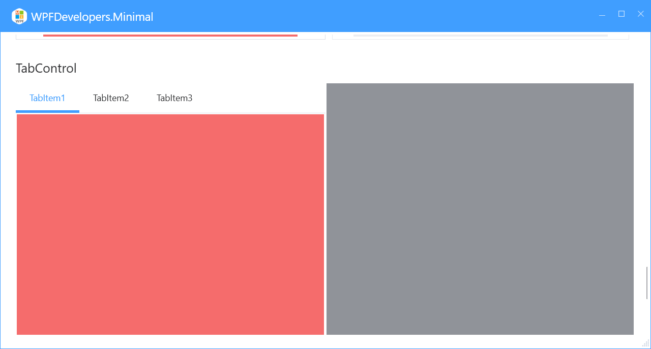
<TabControl>
<TabItem Header="TabItem1">
<Rectangle Fill="{DynamicResource DangerSolidColorBrush}"/>
</TabItem>
<TabItem Header="TabItem2">
<Rectangle Fill="{DynamicResource InfoSolidColorBrush}"/>
</TabItem>
<TabItem Header="TabItem3" >
<Rectangle Fill="{DynamicResource WarningSolidColorBrush}"/>
</TabItem>
</TabControl>
<TabControl TabStripPlacement="Bottom"> **Перевод текста:**
Преобразуется в:
<Элемент TabItem Заголовок="TabItem1">
   <Прямоугольник Заливка="{DynamicResource ИнфоСолидКолорБраш}"/>
</Элемент TabItem>
<Элемент TabItem Заголовок="TabItem2">
   <Прямоугольник Заливка="{DynamicResource ДэнджерСолидКолорБраш}"/>
</Элемент TabItem>
<Элемент TabItem Заголовок="TabItem3">
   <Прямоугольник Заливка="{DynamicResource ВарнингСолидКолорБраш}"/>
</Элемент TabItem>
Аналогично переводятся все фрагменты исходного текста. 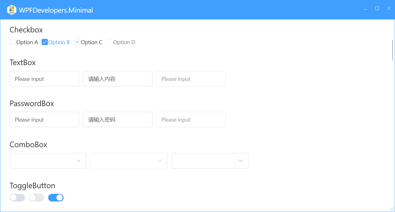
В запросе нет текста технической направленности из области разработки и тестирования программного обеспечения.
Вы можете оставить комментарий после Вход в систему
Неприемлемый контент может быть отображен здесь и не будет показан на странице. Вы можете проверить и изменить его с помощью соответствующей функции редактирования.
Если вы подтверждаете, что содержание не содержит непристойной лексики/перенаправления на рекламу/насилия/вульгарной порнографии/нарушений/пиратства/ложного/незначительного или незаконного контента, связанного с национальными законами и предписаниями, вы можете нажать «Отправить» для подачи апелляции, и мы обработаем ее как можно скорее.
Опубликовать ( 0 )