Слияние кода завершено, страница обновится автоматически
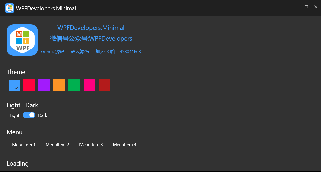
Добро пожаловать в WPFDevelopers.Minimal!


Не рекомендуется обновлять. Перейдите к пользовательской библиотеке.
Присоединяйтесь к QQ группе: 458041663
Следите за нашим публичным аккаунтом в WeChat.
Если вы считаете, что наше открытое программное обеспечение было вам полезно, пожалуйста, сделайте пожертвование.
| Платёжная система | QR-код |
|---|---|
| Alipay |  |
| WeChat Pay |  |

.Net Version
| .Net Version | Статус |
|---|---|
| Net40 | ✅ |
| net45 | ✅ |
| net46 | ✅ |
| net47 | ✅ |
| net48 | ✅ |
| netcoreapp3.0 | ✅ |
| net5.0-windows | ✅ |
| net6.0-windows | ✅ |
Пожалуйста, используйте предварительный пакет Nuget для получения последней версии.
Предварительная версия пакета Nuget >= 3.2.3
Install-Package WPFDevelopers.Minimal
       注意:从旧版升级报错时请把 xmlns:ws="https://github.com/WPFDevelopersOrg.WPFDevelopers.Minimal"
       改成xmlns:ws="https://github.com/WPFDevelopersOrg/WPFDevelopers.Minimal"
    xmlns:ws="https://github.com/WPFDevelopersOrg/WPFDevelopers.Minimal"
    <Application.Resources>
        <ResourceDictionary>
            <ResourceDictionary.MergedDictionaries>
                <ResourceDictionary Source="pack://application:,,,/WPFDevelopers.Minimal;component/Themes/Light.Blue.xaml"/>
                <!--需要注意ws:Resources 必须再配色主题后,Theme="Dark" 为黑色皮肤 -->
                <ws:Resources Theme="Light"/>
                <ResourceDictionary Source="pack://application:,,,/WPFDevelopers.Minimal;component/Themes/Theme.xaml"/>
            </ResourceDictionary.MergedDictionaries>
        </ResourceDictionary>
    </Application.Resources>
xmlns:ws="https://github.com/WPFDevelopersOrg/WPFDevelopers.Minimal"
DataSource
NotifyIcon
Window
Loading ### DataSource
1).cs
using System;
using System.Collections.ObjectModel;
using System.Linq;
using System.Windows;
using WPFDevelopers.Minimal.Sample.Models;

namespace WPFDevelopers.Minimal.Sample.ExampleViews
{
    public partial class MainView : WPFDevelopers.Minimal.Net40.Window
    {
        #region DataSource
        public ObservableCollection<UserModel> UserCollection
        {
            get { return (ObservableCollection<UserModel>)GetValue(UserCollectionProperty); }
            set { SetValue(UserCollectionProperty, value); }
        }

        public static readonly DependencyProperty UserCollectionProperty =
            DependencyProperty.Register("UserCollection", typeof(ObservableCollection<UserModel>), typeof(MainView), new PropertyMetadata(null));


        public bool AllSelected
        {
            get { return (bool)GetValue(AllSelectedProperty); }
            set { SetValue(AllSelectedProperty, value); }
        }

        public static readonly DependencyProperty AllSelectedProperty =
            DependencyProperty.Register("AllSelected", typeof(bool), typeof(MainView), new PropertyMetadata(AllSelectedChangedCallback));

        private static void AllSelectedChangedCallback(DependencyObject d, DependencyPropertyChangedEventArgs e)
        {
            var view = d as MainView;
            var isChecked = (bool)e.NewValue;
            if ((bool)e.NewValue)
                view.UserCollection.ToList().ForEach(y => y.IsChecked = isChecked);
            else
                view.UserCollection.ToList().ForEach(y => y.IsChecked = isChecked);
        }

        #endregion

        public MainView()
        {
            InitializeComponent();
            this.Loaded += MainView_Loaded;
        }

        private void MainView_Loaded(object sender, RoutedEventArgs e)
        {
            var time = DateTime.Now;
            UserCollection = new ObservableCollection<UserModel>();
            for (int i = 0; i < 4; i++)
            {
                UserCollection.Add(new UserModel
                {
                    Date = time,
                    Name = "WPFDevelopers",
                    Address = "No. 189, Grove St, Los Angeles",
                    Children = new System.Collections.Generic.List<UserModel>()
                    {
                         new UserModel { Name= "WPFDevelopers.Minimal1.1" },
                         new UserModel { Name = "WPFDevelopers.Minimal1.2" },
                         new UserModel { Name = "WPFDDevelopers.Minimal1.3" },
                          new UserModel { Name= "WPFDevelopers.Minimal1.4" },
                         new UserModel { Name = "WPFDevelopers.Minimal1.5" },
                         new UserModel { Name = "WPFDevelopers.Minimal1.6" },
                    }
                });
                time = time.AddDays(2);
            }
        }
    }
}
1)XAML
 <ws:NotifyIcon Title="WPF开发者" Name="WpfNotifyIcon">
                <ws:NotifyIcon.ContextMenu>
                    <ContextMenu>
                        <MenuItem Header="托盘消息" Click="SendMessage_Click"/>
                        <MenuItem Header="闪烁" Name="menuItemTwink"  Click="Twink_Click"/>
                        <MenuItem Header="关于" Click="About_Click">
                            <MenuItem.Icon>
                                <Path Data="{StaticResource PathWarning}"
                                      Fill="{DynamicResource PrimaryNormalSolidColorBrush}"
``` **Меню, контекстное меню**

1. XAML
``` XML
 <WrapPanel Margin="0,10">
                    <WrapPanel.ContextMenu>
                        <ContextMenu>
                            <MenuItem Header="1323"/>
                        </ContextMenu>
                    </WrapPanel.ContextMenu>
                    <Menu>
                        <MenuItem Header="MenuItem 1">
                            <MenuItem Header="MenuItem 1.1">
                                <MenuItem Header="MenuItem 1.1.1"/>
                                <MenuItem Header="MenuItem 1.1.2"/>
                            </MenuItem>
                            <Separator/>
                            <MenuItem Header="MenuItem 1.2"/>
                            <MenuItem Header="MenuItem 1.3"/>
                            <MenuItem Header="MenuItem 1.4"/>
                            <MenuItem Header="MenuItem 1.5"/>
                        </MenuItem>
                        <MenuItem Header="MenuItem 2"/>
Окно
ws:Window x:Class="WpfApp.MainWindow"
public partial class MainWindow
MessageBox
WPFDevelopers.Minimal.Controls.MessageBox.Show("文件删除成功。", "消息",MessageBoxButton.OK,MessageBoxImage.Information);
WPFDevelopers.Minimal.Controls.MessageBox.Show("当前文件不存在!", "警告", MessageBoxImage.Warning);
WPFDevelopers.Minimal.Controls.MessageBox.Show("当前文件不存在。", "错误", MessageBoxImage.Error);
WPFDevelopers.Minimal.Controls.MessageBox.Show("当前文件不存在,是否继续?", "询问", MessageBoxButton.OKCancel, MessageBoxImage.Question);
Загрузка
var task = new Task(() =>
{
   //Things to wait for
   Thread.Sleep(5000);
});
task.ContinueWith((previousTask) =>
{
   WPFDevelopers.Minimal.Controls.Loading.Close();
},TaskScheduler.FromCurrentSynchronizationContext());
WPFDevelopers.Minimal.Controls.Loading.Show();
task.Start();
var tokenSource = new CancellationTokenSource();
var cancellationToken = tokenSource.Token;
var task = new Task(() =>
{
  for (int i = 0; i < 5; i++)
  {
   //这里做自己的事情
    if (tokenSource.IsCancellationRequested)return;
    Thread.Sleep(1000);
  }
 }, cancellationToken);
 task.ContinueWith(previousTask =>
 {
   if (tokenSource.IsCancellationRequested)return;
  Loading.Close();
 }, TaskScheduler.FromCurrentSynchronizationContext());
 Loading.Show(true);
 Loading.LoadingQuitEvent += delegate
 {
   tokenSource.Cancel();
 };
task.Start();
Выход
private void Quit_Click(object sender, RoutedEventArgs e)
        {
            Application.Current.Shutdown();
        }
О программе
private void About_Click(object sender, RoutedEventArgs e)
        {
            new AboutWindow().Show();
        }
Отправить сообщение
private void SendMessage_Click(object sender, RoutedEventArgs e)
        {
            NotifyIcon.ShowBalloonTip("Message", " Welcome to WPFDevelopers.Minimal ",NotifyIconInfoType.None);
        }
Мигание
private void Twink_Click(object sender, RoutedEventArgs e)
        {
            WpfNotifyIcon.IsTwink = !WpfNotifyIcon.IsTwink;
            menuItemTwink.IsChecked = WpfNotifyIcon.IsTwink;
        }
``` **Меню**
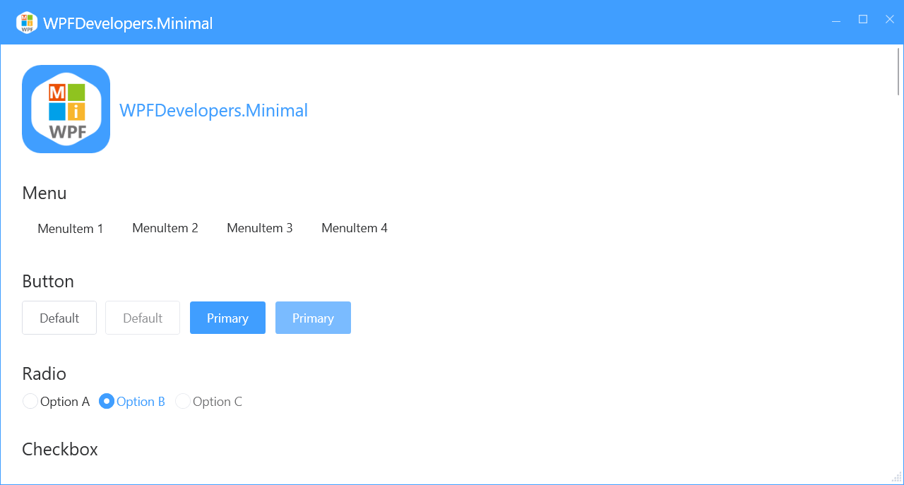
Кнопка
 <WrapPanel Margin="0,10">
                    <Button Content="По умолчанию"/>
                    <Button Content="По умолчанию" Margin="10,0" IsEnabled="False"/>
                    <Button Content="Основная" Style="{StaticResource PrimaryButton}"/>
                    <Button Content="Основная" Style="{StaticResource PrimaryButton}" Margin="10,0" IsEnabled="False"/>
 </WrapPanel>
Радиокнопка
 <WrapPanel Margin="0,10">
                   <RadioButton Content="Вариант A"/>
                    <RadioButton Content="Вариант B" Margin="10,0" IsChecked="True"/>
                    <RadioButton Content="Вариант C" IsEnabled="False"/>
 </WrapPanel>
Флажок
 <WrapPanel Margin="0,10">
                 <CheckBox Content="Вариант A"/>
                 <CheckBox Content="Вариант B" Margin="10,0" IsChecked="True"/>
                 <CheckBox Content="Вариант C" IsChecked="{x:Null}"/>
                 <CheckBox Content="Вариант D" Margin="10,0" IsEnabled="False"/>
 </WrapPanel>
Текстовое поле
 <WrapPanel Margin="0,10">
                  <TextBox/>
                    <TextBox Margin="10,0" ws:ElementHelper.Watermark="Пожалуйста, введите содержимое"/>
                    <TextBox IsEnabled="False"/>
 </WrapPanel>
Поле для ввода пароля
 <WrapPanel Margin="0,10">
                <PasswordBox />
                    <PasswordBox Margin="10,0" ws:ElementHelper.Watermark="Введите пароль"/>
                    <PasswordBox IsEnabled="False"/>
                     <!--Водяной знак и пароль перекрываются-->
                     <PasswordBox Margin="10,0" ws:ElementHelper.Watermark="Введите пароль"
                     ws:PasswordBoxHelper.IsMonitoring="True"/>
                    <!--MVVM Binding-->
                     <PasswordBox ws:PasswordBoxHelper.IsMonitoring="True"
                         ws:ElementHelper.Watermark="Введите пароль"
                         helpers:PasswordBoxHelper.Attach="True"
                         helpers:PasswordBoxHelper.Password="{Binding Path=Account.PassWord,Mode=TwoWay,UpdateSourceTrigger=PropertyChanged}" Margin="0,10"/>
 </WrapPanel>
Комбинированный список
 <WrapPanel Margin="0,10">
              <ComboBox Width="200">
                        <ComboBoxItem>Вариант 1</ComboBoxItem>
                        <ComboBoxItem>Вариант 2</ComboBoxItem>
                        <ComboBoxItem>Вариант 3</ComboBoxItem>
                        <ComboBoxItem>Вариант 4</ComboBoxItem>
                        <ComboBoxItem>Вариант 5</ComboBoxItem>
                    </ComboBox>
 </WrapPanel>
Переключатель
 <WrapPanel Margin="0,10">
           <ToggleButton/>
                    <ToggleButton Margin="10,0" IsEnabled="False"/>
                    <ToggleButton IsChecked="True"/>
 </WrapPanel> ### DatePicker

1) XAML
``` XML
 <WrapPanel Margin="0,10">
           <DatePicker Width="200"/>
                    <DatePicker Width="200" SelectedDateFormat="Long" Margin="10,0"/>
                    <DatePicker Width="200" IsEnabled="False"/>
 </WrapPanel>
 <WrapPanel Margin="0,10">
           <Slider Width="200"/>
                    <Slider Width="200" Value="50" Maximum="100"  Margin="10,0"/>
                    <Slider Width="200" Value="50" Maximum="100" IsEnabled="False"/>
 </WrapPanel>
 <WrapPanel Margin="0,10">
         <ProgressBar Width="200" Value="50" />
                    <ProgressBar Width="200" Margin="10,0"  Value="80" ws:ElementHelper.IsStripe="True"/>
                    <ProgressBar Width="200" Margin="10,0" IsIndeterminate="True" Value="10"/>
 </WrapPanel>
 <WrapPanel Margin="0,10">
          <DataGrid AutoGenerateColumns="False" HeadersVisibility="All" RowHeaderWidth="40"
                                  ItemsSource="{Binding UserCollection,RelativeSource={RelativeSource AncestorType=local:MainView}}"
                                  Margin="0,10">
                            <DataGrid.RowHeaderTemplate>
                                <DataTemplate>
                                    <CheckBox IsChecked="{Binding IsSelected,RelativeSource={RelativeSource AncestorType=DataGridRow}}"/>
                                </DataTemplate>
                            </DataGrid.RowHeaderTemplate>
                            <DataGrid.Columns>
                                <DataGridTextColumn Header="Date" Binding="{Binding Date}" IsReadOnly="True"/>
                                <DataGridTextColumn Header="Name" Binding="{Binding Name}" IsReadOnly="True"/>
                                <DataGridTextColumn Header="Address" Binding="{Binding Address}" IsReadOnly="True"/>
                            </DataGrid.Columns>
                        </DataGrid>
 </WrapPanel>
 <WrapPanel Margin="0,10">
        <DataGrid AutoGenerateColumns="False"
                                  ItemsSource="{Binding UserCollection,RelativeSource={RelativeSource AncestorType=local:MainView}}"
                                  Margin="0,10">
                            <DataGrid.Columns>
                                <DataGridTemplateColumn CanUserResize="False">
                                <DataGridTemplateColumn.HeaderTemplate>
                                    <DataTemplate>
                                        <CheckBox IsChecked="{Binding RelativeSource={RelativeSource Mode=FindAncestor, AncestorType=local:MainView}, Path=AllSelected}" />
                                    </DataTemplate>
                                </DataGridTemplateColumn.HeaderTemplate>
                                <DataGridTemplateColumn.CellTemplate>
                                    <DataTemplate>
                                        <CheckBox Margin="10,0,0,0" IsChecked="{Binding IsChecked}"/>
                                    </DataTemplate>
                                </DataGridTemplateColumn.CellTemplate>
                            </DataGridTemplateColumn>
                                <DataGridTextColumn Header="Date" Binding="{Binding Date}" IsReadOnly="True"/>
                                <DataGridTextColumn Header="Name" Binding="{Binding Name}"
``` **Граница (Border)**
</HierarchicalDataTemplate>
TreeView.ItemTemplate
</TreeView.ItemTemplate>
TreeView
</WrapPanel>
Рисунок 1. TreeView
  <UniformGrid Margin="0,10" Columns="2">
                    <Expander Header="Expander1">
                        <Rectangle Fill="{DynamicResource DangerSolidColorBrush}"
                                   Width="400" Height="300"/>
                    </Expander>
                    <Expander Header="Expander1" ExpandDirection="Up" Margin="10,0" FlowDirection="RightToLeft" IsExpanded="True">
                        <Rectangle Fill="{DynamicResource LightSolidColorBrush}"
                                   Width="400" Height="300"/>
                    </Expander>
                    <Expander ExpandDirection="Right" Margin="0,10">
                        <Expander.Header>
                            <TextBlock Text="Expander1">
                                <TextBlock.LayoutTransform>
                                    <RotateTransform Angle="90"/>
                                </TextBlock.LayoutTransform>
                            </TextBlock>
                        </Expander.Header>
                        <Rectangle Fill="{DynamicResource CircularSingularSolidColorBrush}"
                                   Width="400" Height="300"/>
                    </Expander>
                    <Expander ExpandDirection="Left" Margin="10" IsExpanded="True">
                        <Expander.Header>
                            <TextBlock Text="Expander1">
                                <TextBlock.LayoutTransform>
                                    <RotateTransform Angle="90"/>
                                </TextBlock.LayoutTransform>
                            </TextBlock>
                        </Expander.Header>
                        <Rectangle Fill="{DynamicResource PrimaryNormalSolidColorBrush}"
                                   Width="400" Height="300"/>
                    </Expander>
                </UniformGrid>
Рисунки 2–5. Expander
 <WrapPanel Margin="0,10">
      <GroupBox Header="GroupBox1">
                        <Rectangle Fill="{DynamicResource DangerSolidColorBrush}"
                                   Width="400" Height="300"/>
                    </GroupBox>
                    <GroupBox Header="GroupBox1" Margin="10,0" IsEnabled="False">
                        <Rectangle Fill="{DynamicResource LightSolidColorBrush}"
                                   Width="400" Height="300"/>
                    </GroupBox>
 </WrapPanel>
Рисунок 6. GroupBox
  <UniformGrid Columns="2" Rows="2" Margin="0,10">
                    <UniformGrid.Resources>
                        <Style TargetType="{x:Type Rectangle}">
                            <Setter Property="Width" Value="{x:Static SystemParameters.PrimaryScreenWidth}"/>
                            <Setter Property="Height" Value="400"/>
                        </Style>
                    </UniformGrid.Resources>
                    <TabControl>
                        <TabItem Header="TabItem1">
                            <Rectangle Fill="{DynamicResource DangerSolidColorBrush}"/>
                        </TabItem>
                        <TabItem Header="TabItem2">
                            <Rectangle Fill="{DynamicResource

``` **Текст запроса представляет собой фрагмент кода на языке XAML, который используется для разработки пользовательского интерфейса в приложениях**.

В запросе описывается структура пользовательского интерфейса с использованием элементов управления TabControl и GridSplitter. Также приводятся примеры использования тем оформления с названиями «Blue», «Green», «Red» и «Orange».

**Перевод текста запроса**:
<!-- Пример использования элемента управления GridSplitter -->
<Grid Margin="0,10">
    <Grid.ColumnDefinitions>
        <ColumnDefinition/>
        <ColumnDefinition Width="Auto" />
        <ColumnDefinition/>
    </Grid.ColumnDefinitions>
    <Rectangle Fill="AliceBlue" Grid.Column="0"/>
    <GridSplitter Grid.Column="1"
                  HorizontalAlignment="Center"
                  VerticalAlignment="Stretch"
                  ShowsPreview="True"
                  Width="5"
                />
    <Rectangle Fill="Pink" Grid.Column="2"/>
</Grid>
Вы можете оставить комментарий после Вход в систему
Неприемлемый контент может быть отображен здесь и не будет показан на странице. Вы можете проверить и изменить его с помощью соответствующей функции редактирования.
Если вы подтверждаете, что содержание не содержит непристойной лексики/перенаправления на рекламу/насилия/вульгарной порнографии/нарушений/пиратства/ложного/незначительного или незаконного контента, связанного с национальными законами и предписаниями, вы можете нажать «Отправить» для подачи апелляции, и мы обработаем ее как можно скорее.

Комментарии ( 0 )